The problem
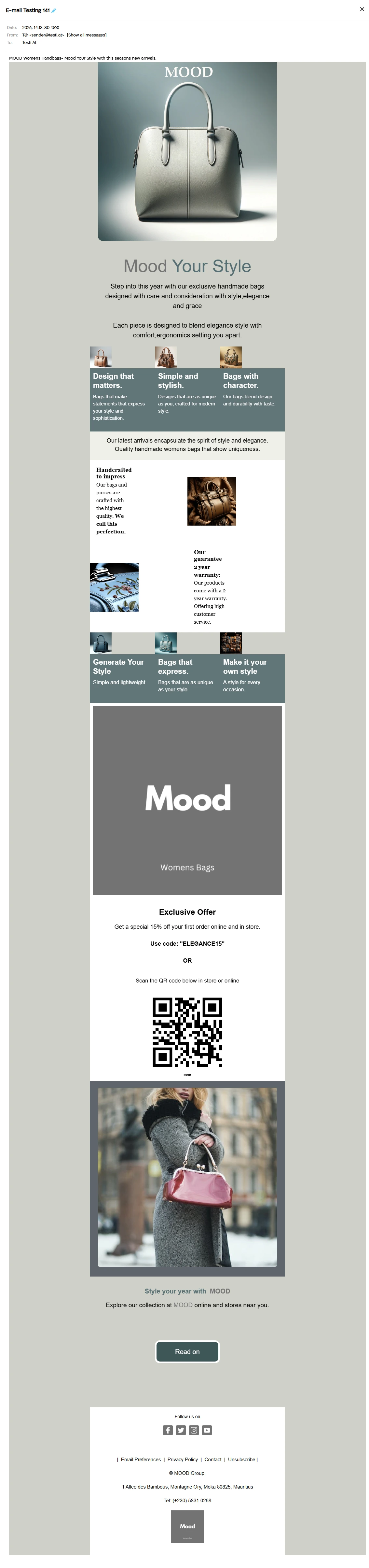
While testing an MJML email in a webmail client, the images in my 3-column layout shrank and separated from each other instead of sitting flush. The same thing happened in my 2-column layout and in my 2-column image and text layout. I had wrapped the columns in <mj-group>.
Where it happens
Client: Wall! Mail (webmail), viewed in Google Chrome. I didn't record a version.
Layouts affected: 3 columns, 2 columns, and 2 columns with image and text
Viewport: desktop browser window, about 1200px wide
The cause
Padding: Confirmed. Setting the padding to 0 fixed the shrinking and gaps.
mj-group: Not identified. It still caused problems after the padding fix, and I haven't found out why.
mj-image has a default padding of 10px 25px. In a 3-column layout on a 600px email, each column is about 200px wide, so the padding takes 50px away from each image. That leaves a 150px image in a 200px column, with 50px of space between neighbouring images. That matches what I saw at a 1200px desktop window: smaller images with gaps between them instead of flush ones.
The percentage columns and the fixed padding also scale differently. A column shrinks in proportion to the screen, but the padding is a fixed number of pixels, so on narrower screens the padding would take a bigger share of each column and squeeze the image more than the column. I only tested this at desktop width, so I haven't seen that happen. It is still a good reason to set the padding yourself instead of relying on the default.
Zeroing the padding fixed that part. What I can't explain is why mj-group kept misbehaving in this client. I compiled and tested the layouts both ways and the grouped version was the one that failed.
I also looked at the column widths (33.33% for three columns, 50% for two). I found no evidence that they cause the problem. They are MJML's normal defaults, and I couldn't tie the behaviour to them, so I don't count them as a cause.
The affected HTML and where it is
This is the compiled output of the simplified 3-column example in the next section, built with MJML 5.4.1. It is not my client's email, but the structure is the same. The problem lives in three places inside the <body>, all inside the table cell that holds the group.
1. The group wrapper. mj-group compiles to an extra div that holds all three columns:
<div class="mj-column-per-100 mj-outlook-group-fix"
     style="font-size:0;line-height:0;text-align:left;display:inline-block;width:100%;direction:ltr;">
2. Each column inside the group. The width is written inline as 33%:
<div class="mj-column-per-33-333333333333336 mj-outlook-group-fix"
     style="font-size:0px;text-align:left;direction:ltr;display:inline-block;vertical-align:top;width:33%;">
3. The image cell inside each column. This is where the default padding and a fixed image width appear:
<td align="center" style="font-size:0px;padding:10px 25px;word-break:break-word;">
  <table ...><tbody><tr>
    <td style="width:150px;">
      <img alt="" src="placeholder.jpg" width="150" height="auto"
           style="border:0;display:block;outline:none;text-decoration:none;height:auto;width:100%;font-size:13px;" />
The numbers add up: a 600px email split into three gives a 200px column, minus 25px of padding on each side leaves a 150px image. At a 1200px desktop window the email is still 600px wide, so each image ends up at 150px instead of 200px, with 50px of space between images. That is the shrinking and separation I saw.
The same layout without mj-group and with padding 0. Here the column div carries an inline width of 100%, the image cell has no padding, and the image is 200px:
<div class="mj-column-per-33-333333333333336 mj-outlook-group-fix"
     style="font-size:0px;text-align:left;direction:ltr;display:inline-block;vertical-align:top;width:100%;">
...
<td align="center" style="font-size:0px;padding:0;word-break:break-word;">
  ...<td style="width:200px;"><img ... width="200" ... />
One more difference is worth knowing. In the grouped output, the column width of 33% is written inline. In the ungrouped output, the inline width is 100%, and the side-by-side layout comes from a media query in the head of the email:
@media only screen and (min-width:480px) {
  .mj-column-per-33-333333333333336 { width: 33.333333333333336% !important; max-width: 33.333333333333336%; }
}
So the two versions depend on different things: one on fixed inline widths, the other on the head styles. That may be why one client handled them differently. I haven't confirmed that, so treat it as a lead and not a cause.
The fix
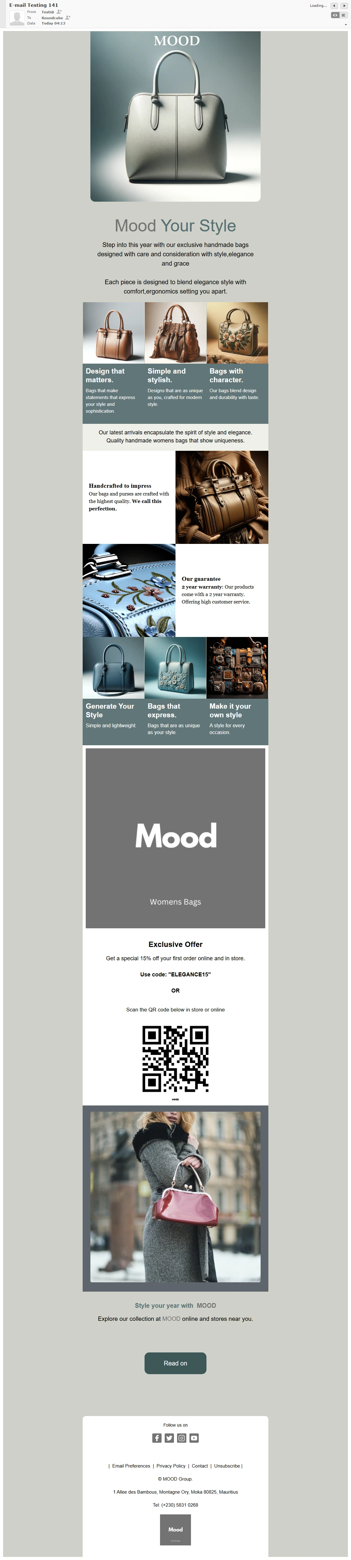
Two changes. First, zero the padding on the images (and on the section if you want the layout flush to the edges). Second, drop mj-group and use plain columns.
Before (images shrink and separate):
<mj-section>
  <mj-group>
    <mj-column><mj-image src="placeholder.jpg" /></mj-column>
    <mj-column><mj-image src="placeholder.jpg" /></mj-column>
    <mj-column><mj-image src="placeholder.jpg" /></mj-column>
  </mj-group>
</mj-section>
After (images and text stay together):
<mj-section padding="0">
  <mj-column><mj-image src="placeholder.jpg" padding="0" /></mj-column>
  <mj-column><mj-image src="placeholder.jpg" padding="0" /></mj-column>
  <mj-column><mj-image src="placeholder.jpg" padding="0" /></mj-column>
</mj-section>
These are simplified snippets. My production layouts had more content, but the changes were the same. If you want a small gap between images, use something like padding="0 4px" instead of 0.
What I retested
- Wall! Mail in Chrome: fixed in the 3-column, 2-column, and 2-column image and text layouts
I haven't verified the fix in every client, so test it in yours before relying on it.
What I'd check next
The compiled HTML above shows where the two versions differ. To find the real cause, I'd check whether Wall! Mail keeps the <style> block from the head of the email, since the ungrouped version relies on it for the side-by-side layout and the grouped version doesn't. Viewing the delivered source in the client and testing at a few widths would settle it. If you've seen this and know the cause, get in touch and I'll update this post.
Takeaway
Don't trust MJML's default padding in tight multi-column layouts: set padding="0" on images and check the compiled output. If mj-group misbehaves in a client, plain columns are a working fallback.